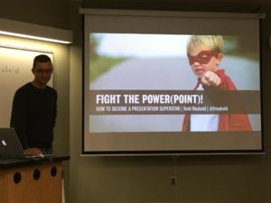
Today was the first Boreas Leadership Program workshop of the fall semester and the subject was on Building Better Presentations. The workshop “Fight the Power(Point)! How to Become a Presentation Superstar” was facilitated by Todd Reubold of the Institute on the Environment Communications Director, University of Minnesota.
It was a great workshop with lots of good takeaways, such as:
-use one point per slide
-design your slides for the back of the room
-Helvetica is a good font to use
-30-40 size font is good
-never use clip art
-don’t pick random photos online
-put your source in the lower right corner
-background should be white or dark – such as black or dark gray, don’t use color
-at the end have a conclusion/whats next (don’t need to write ‘questions’)
-design is important
-data slide is not about data, but about the meaning of the data
-start your presentation with a story or fact
-don’t hide behind a podium or computer
-leave the lights on
-be yourself, but be more interesting
-try not to use bullet points
-never use comic sans
-use the NOTES feature in your PowerPoint for you to see and read
-don’t lose an audience to their iPhone
-try not to use a laser pointer (your cat is not there), move to the screen
-don’t turn your back on the audience
-don’t read off the slides
-logic and emotion
-practice
-arrive early, mingle, get people to sit close, and breath (take a few deep breaths before you start)
-10 minutes and attention crashes, so ok to have a totally blank slide to get them to focus on you

